




Showing posts with label The House List. Show all posts

Friday, August 17, 2012

Step by Step

Sing it with me! 

"Oooh, baby!  Gonna get to you girrrrl!"

Fellow children of the early 80's, who was your favorite?  Was it the youngest with his baby blues Joey? Or were you a bad boy fan with the pierced Jordan?


 On the count of three, let's all blurt out which NKOTB boy we had a crush on.   
Ready?

One...

Two...

Three!

Danny!

I kid, I kid! I remember having a lively debate over which boy was hottest with my second grade friends, but we all agreed that the horsey Danny was not our favorite.  Do you concur?

via

This is the wierdest intro I've ever had for a post.  Moving on!

With my summer winding down (this is my last week day off), I decided to jam in another Pinterest inspired project: numbered steps.  This is a trend that I see as being very taste-specific, so it will not surprise me if this is not most people's decor choice.  There is just something about bold numbers on stairs that I find kind of whimsical and crisp.

My inspiration photo:

 via Pottery Barn

First, I showed my stairs some TLC.  They had become rather chipped and scarred, and not in a "look-how-shabby-chic-we-are" way.


 Yeesh... 

I painted all of the stairs in Behr's paint and primer in one in semi-gloss.  It was much more time consuming than I thought it would be, but at least I could watch 500 Days of Summer with Dan through the arm rail slats as I worked.

While I debated whether I should use a stencil to paint the numbers on the stairs, Dan reminded me that when we sell our house the realtor might ask us to remove the numbers since they're taste specific.  I settled on vinyl rub-on numbers since I can blow my hair dryer on them and peel them off easily if we need to.   The numbers come from OZA Vinyl Graphics on Etsy and were pretty simple to use.

I simply measure the stairs, taped them in place, used a pencil to mark where to put them, peeled off the backing, rubbed each one on, and peeled off the top layer.  I know that sounds like too many steps (pun!) but it wasn't nearly as time consuming as painting all of them and went quicker than I had anticipated.

First numbers:

In progress:


I like this landing now.  It could use a bit more black-framed art, but it's so much warmer than before.

I feel like the numbered stairs kind of go with the black frame on the art (sentimental wedding gift featuring the bridge in Central Park where Dan proposed):


Again, it's probably not everyone's thing, but I'm liking this wierd trend.  It's like eyeliner for my steps, making them pop a bit.   Look at them, all flirty now like, "Here we are!"
Off to enjoy my last day off!

Wednesday, August 15, 2012

Let's get lost together

I like the recent travel boards people have been doing on Pinterest, so I decided to try it for myself.   I think the picture below spanks mine, though.  What a world traveler!

It's almost a little smug, you know?  I'm thinking, "Okay, Carmen Sandiego, we get it!  You like to travel!"

 Reminds me of another pinterest thing that popped up lately:


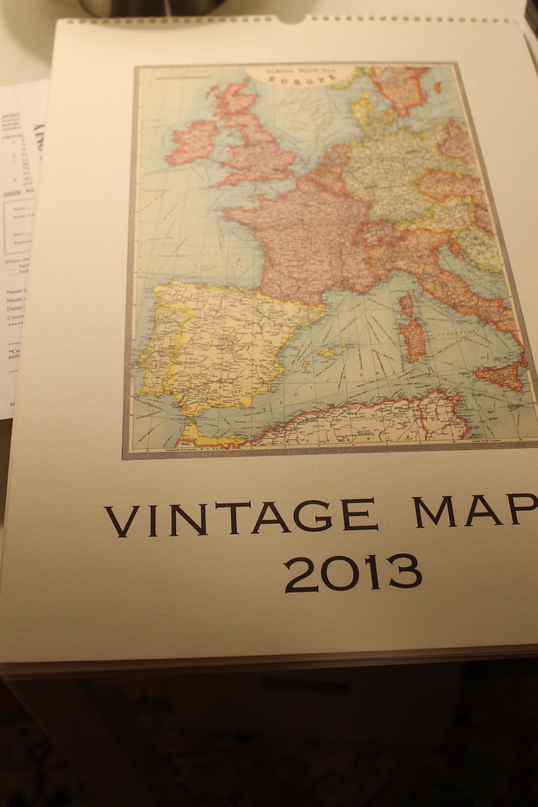
But back to my twenty minute project! I'm not artsy enough to create something from scratch, but I found a gorgeous calendar featuring vintage maps for $20 at a local gift shop.  The cover was a print of Europe that I thought would work well for documenting our travels, and I figured the added bonus is that I can still use the rest of the calendar come 2013.


I bought a sticker book from the dollar bin at Target for summer school this year, and I realized yesterday that I could use a hole punch on the bottom stars to create little dots of color to indicate cities we have visited.


Really, there's no need for the blow by blow of this project, but I will anyway.  I just hole punched the star stickers in five different colors, one for each country that we visited (three together/ two separately).

Then, we just placed the dots on the different countries we've visited:

I created a little key for the bottom corner, cut out the map, and popped it in a frame.  Voila!  Easy, custom art for our office:


I like the idea of framing a map because Dan and I are always getting lost on our vacations together.  Even though he has a solid sense of direction, I inevitably want to visit some obscure  place, like a pastry shop I read about on Trip Advisor, so he has to do tons of map reading.  He's constantly threatening to give me "map lessons" since my sense of direction is so backwards, but I wriggle out of that by feeding his ego, "But, hon, I have you!"

Side note:  While I'm horrible at reading maps, I am the only one of the two of us who can fold them back up into the neat little rectangles.  Anyone else notice that about their significant other??  What is so hard about using the creases to fold it up again??  I do have to admit that I feel oddly smug when he spends ten minutes expertly navigating us through some complex city... and then has to sheepishly hand the map to me to fold. 

I'm happy with my simple map art.  Definitely has some sentimental value!

I'm almost done tweaking my office, so more pictures of that soon!  Anyone else doing anything "pinteresting" lately?

Saturday, July 21, 2012

Bye bye, Mr. Hyde!

I've heard before that you should paint a section of wall and see the color in different lights before making a final decision.  Yeah, I didn't do that.  Which is why I somehow painted our living room, stairwell, and hallway all the same color:  Behr's "Warm Muffin". Little did I know that the paint had a Dr. Jekyll/ Mr. Hyde complex.

You know, like sometimes it would be warm Dr. Jekyll, all cozy and mature.  It never quite went with our furniture or rug, but I would think... "Meh, but at least it's still a decent color!"

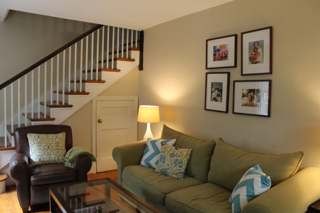
Then, other times its Mr. Hyde side would lurk, and I would be struck with how much it clashed with our sofa.  It was kind of an orange sherbert color:
Photobucket

Photobucket

I decided this summer that I had had enough of the overly warm wall color and the too dark mirror.  To remedy it, I picked out a new color for the walls (Olympic's Toasted Almond) and spent a few hours sloshing three coats of glossy white paint on the mirror. 
 Photobucket

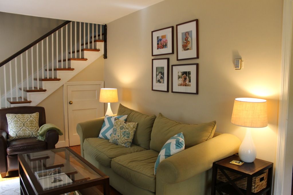
I don't know if these pictures capture the change very well, but I am loving the new color.  It goes better with our furniture, matches the rug, and feels calming.

Toasted Almond doesn't switch on me in different lights.


 Photobucket
Photobucket

Can you see the change at all?
Photobucket Photobucket   Photobucket  

I finally settled the debate of what to put in the apothecary glass on our mantle.  After nixing fresh fruit (done that, sick of the sticky mess when I inevitably forget to switch it out), I decided to fill it with postcards from our trips to Italy, France, London, and my birthday trip to Savannah.  It makes me smile, and when I have time later, I plan to steal the YHL idea of writing down what we did on each trip to read later.  Easy and sentimental
Photobucket 
Photobucket
Photobucket

You can see in the last picture how the wall and rug are in the same color family now:
Photobucket

It may be pretty basic beige type color, but I'm okay with Mr. Dependable.  Anyone else been changing their minds about house stuff too?


Wednesday, February 8, 2012

Target is as trendy as I get

I'm always the last to catch on to a trend. Case in point: I bought my first pair of skinny jeans and high boots combo this January when everyone else had latched on to this look about two years ago. Side note: I was surprised that I ended up loving said skinny jeans because they are actually comfortable and stretchy, like yoga pants. Now, I'm just hoping the trend isn't over, say, next month.

Anyway, I'm the same was about home design trends. You know how the past few years blogs and then Pinterest have been all about the chevron print? These zany stripes look so chic and I-didn't-try-too-hard-because-I-am-bold-enough-to-do-crazy-pattern.


via House Beautiful

via here

I finally jumped on that home trend! Yep, 2010 is calling and wanting its print back. Target finally has some chevron pillows and lamp shades for $20 a pop. Dan indulged me by driving with me twenty-five minutes so I could snag the last two in the greater Richmond area.


I decided to replace the brown pillows in my living room:


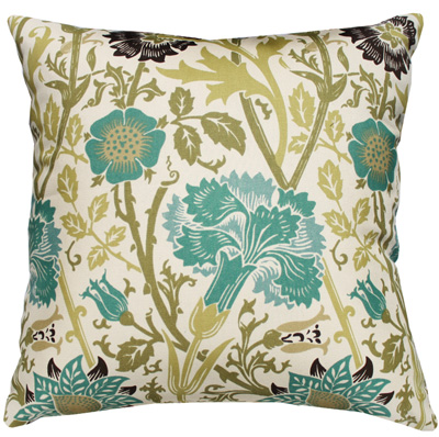
I wanted to play off the turquoise in the flowery print I have on these pillows:

Photobucket


Ignore the clashy yellow walls (they're getting a new color this summer) and focus on the magic of chevron. Ooh... crisp! And they distract from the fugly green couch!


In my bedroom, I decided to perk up the corner, which has the same pillow (I buy three of anything that I like which is unoriginal but makes matching easy), chair, and some homemade paint chip art:

Photobucket


Since the paint chip art has gold in it...
Photobucket


... so I went with the gold chevron shade. I was worried the gold would look like something, say, Mariah Carey would have in her diva dressing room, but it I kind of like it against the blue.
Photobucket


The Ikea lamp post probably needs another coat of white spray paint, but over all, I was pretty pleased with the look:
Photobucket

Photobucket


Any trends that you are loving right now? Or have you also jumped on the chevron bandwagon before it officially creaks to a stop?


So I went with two of these chevron guys:Photobucket
Related Posts Plugin for WordPress, Blogger...