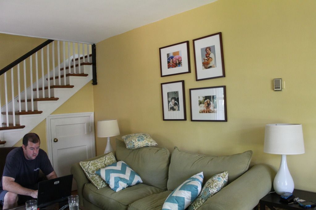
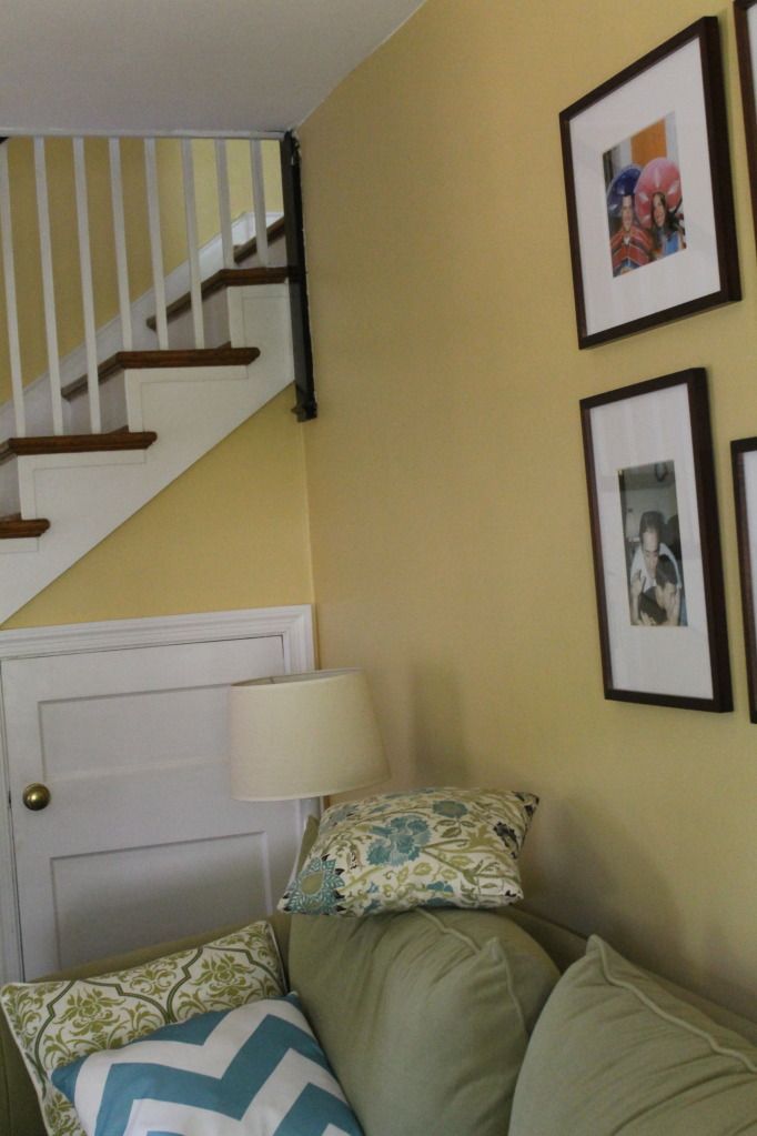
I've heard before that you should paint a section of wall and see the color in different lights before making a final decision. Yeah, I didn't do that. Which is why I somehow painted our living room, stairwell, and hallway all the same color: Behr's "Warm Muffin". Little did I know that the paint had a Dr. Jekyll/ Mr. Hyde complex.
You know, like sometimes it would be warm Dr. Jekyll, all cozy and mature. It never quite went with our furniture or rug, but I would think... "Meh, but at least it's still a decent color!"
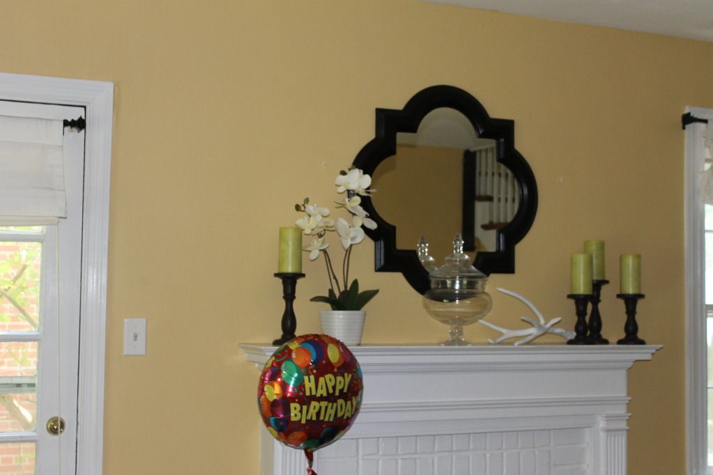
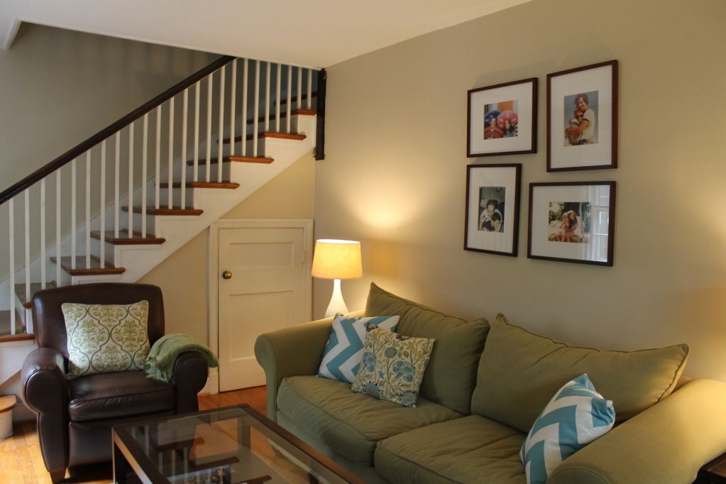
Then, other times its Mr. Hyde side would lurk, and I would be struck with how much it clashed with our sofa. It was kind of an orange sherbert color:
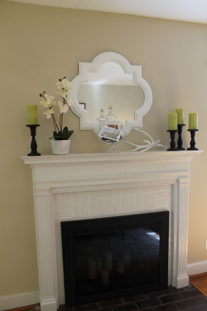
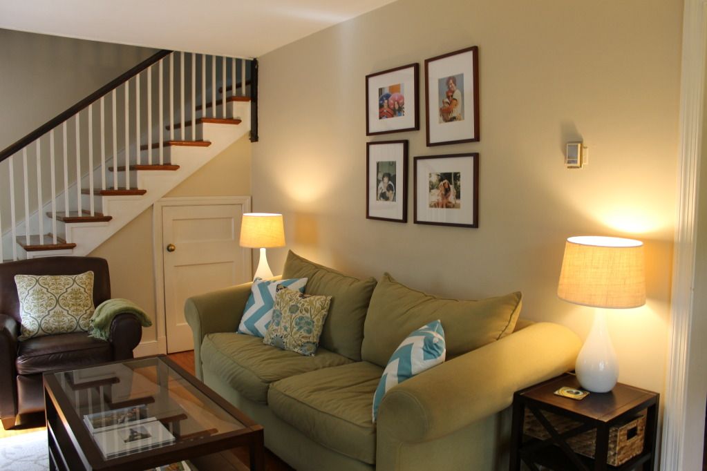
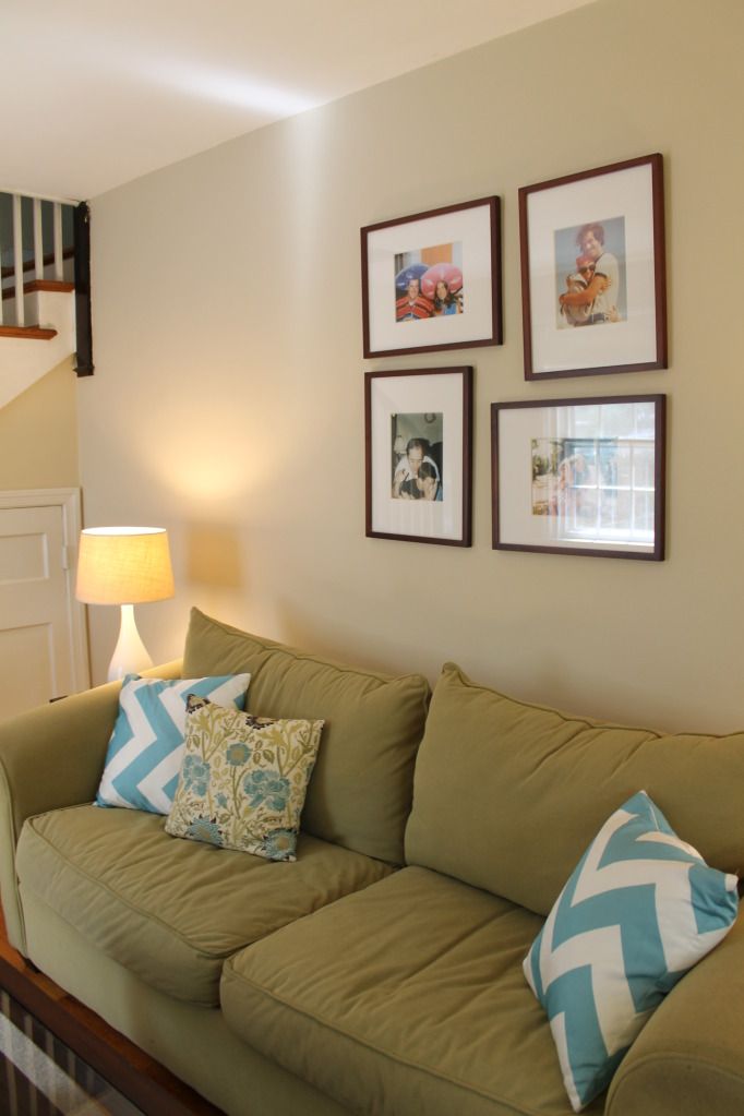
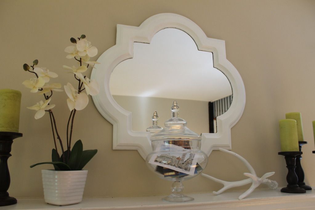
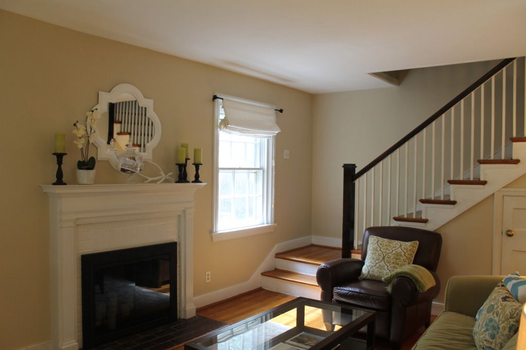
I decided this summer that I had had enough of the overly warm wall color and the too dark mirror. To remedy it, I picked out a new color for the walls (Olympic's Toasted Almond) and spent a few hours sloshing three coats of glossy white paint on the mirror.
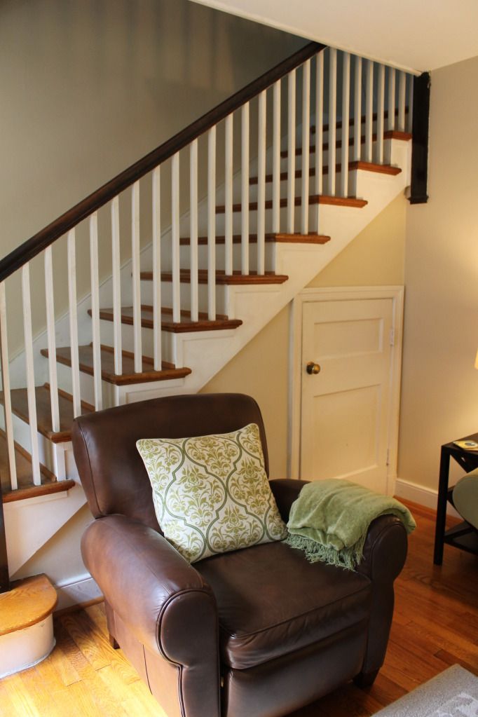
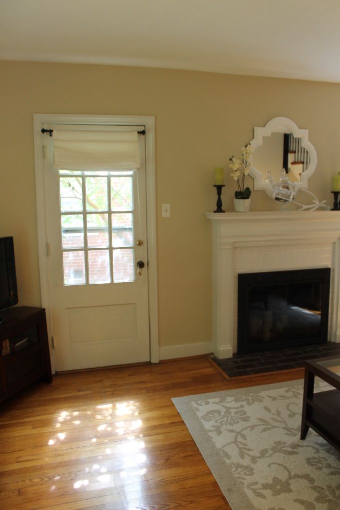
I don't know if these pictures capture the change very well, but I am loving the new color. It goes better with our furniture, matches the rug, and feels calming.
Can you see the change at all?
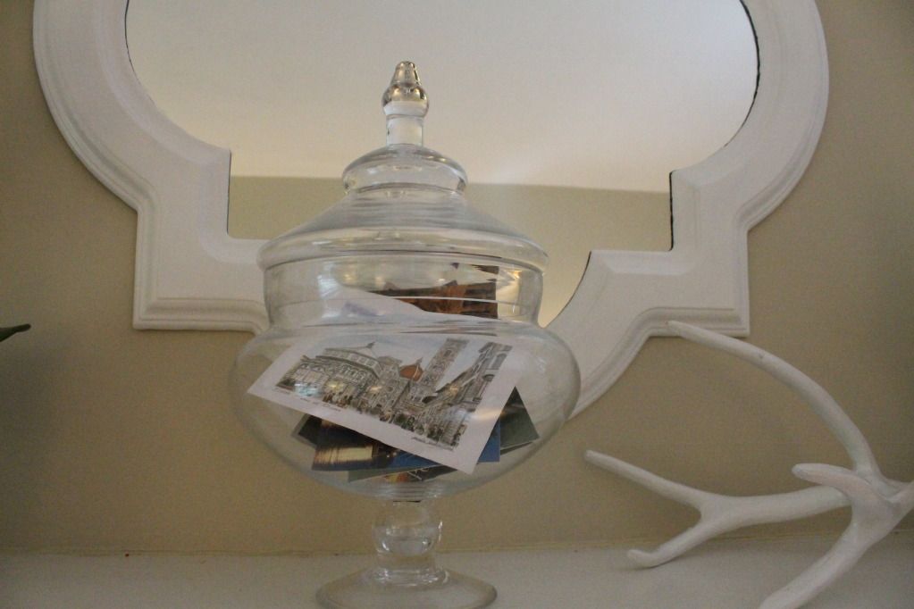
I finally settled the debate of what to put in the apothecary glass on our mantle. After nixing fresh fruit (done that, sick of the sticky mess when I inevitably forget to switch it out), I decided to fill it with postcards from our trips to Italy, France, London, and my birthday trip to Savannah. It makes me smile, and when I have time later, I plan to steal the YHL idea of writing down what we did on each trip to read later. Easy and sentimental
You can see in the last picture how the wall and rug are in the same color family now:
It may be pretty basic beige type color, but I'm okay with Mr. Dependable. Anyone else been changing their minds about house stuff too?




3 comments:
I totally see a difference! It's so warm and pretty.
xo Josie
www.winksmilestyle.com
Love, love, love the change!
A yellow is always cheery, but I agree that it has a tendancy to change hues on you and all of a sudden you're like, "Wait a tick. This doesn't look as good as I thought..."
I think toasted almond did you well! And the switch to a white frame looks fabulous too. It just looks really crisp and fresh. :)
Also, I've been saving all my vacay postcards, ticket stubs and such to make a similar memory jar! Might as well display those goodies, right?
As always, in love with your mantle. Sigh.
I definitely see the difference! The first color is fun, but I guess brighter colors work better as accent walls? (this is coming from the girl who used to have neon walls. what the hell do I know? hah) The second color looks great!
Post a Comment